When Asian Style Office Decor Feels Overdone
Asian Style Office Decor Feels Most Effective When It Is Purposeful Rather Than Thematic
Asian-inspired design can give an office a sense of calm, permanence, craftsmanship, and cultural depth. It can also become visually overwhelming when every surface, wall, and furniture piece competes to communicate the same idea. For workplace designers and office fit-out buyers, the objective is not to make an office resemble a museum, restaurant, or themed retail environment. The objective is to create a professional workplace where selected cultural references support the brand, improve the visitor experience, and remain suitable for daily work.
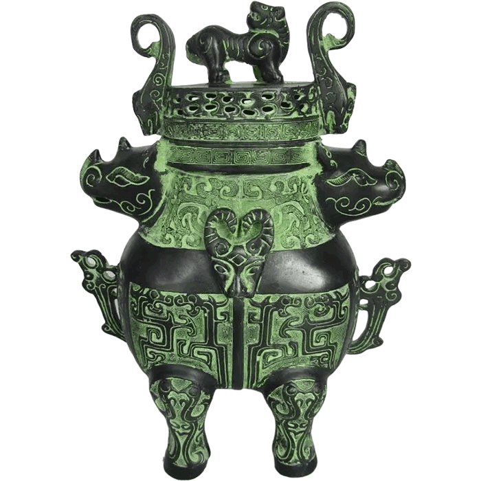
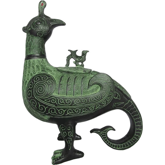
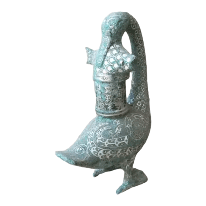
Bronze artworks, vessels, mirrors, animal sculptures, and Buddhist figures can contribute meaningful visual weight to reception areas, executive suites, meeting rooms, and hospitality spaces. However, these pieces need room around them. A finely cast bronze object is often most memorable when it is displayed with restraint, appropriate lighting, and a clear relationship to the architecture.
This guide explains the warning signs of excessive styling, the practical limits of decorative density, and a measured approach to selecting bronze art for contemporary offices.
Why Asian Style Office Decor Can Become Visually Excessive
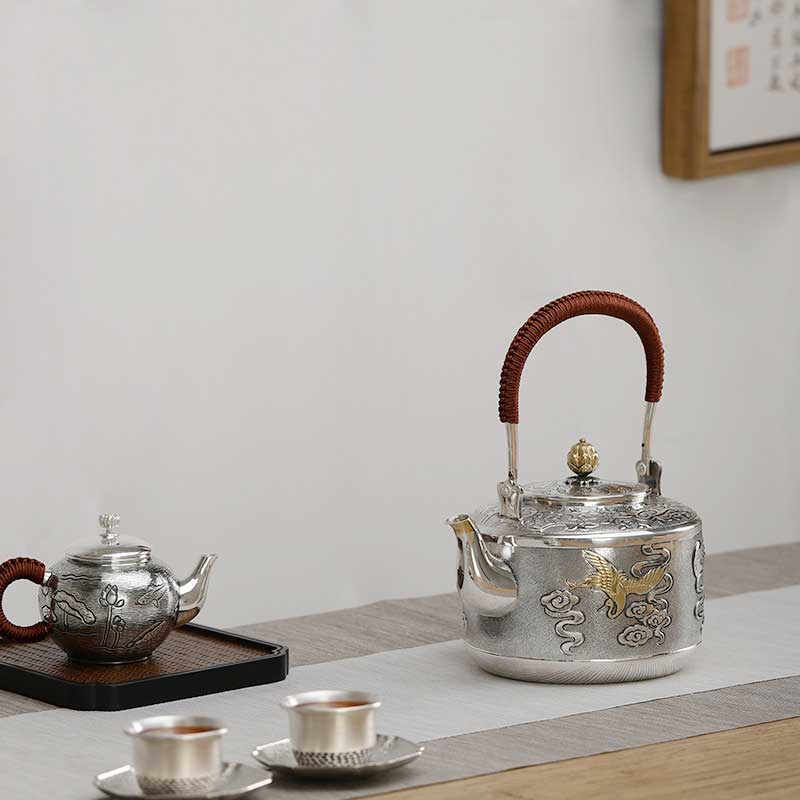
An office feels overdone when its decorative language becomes repetitive, literal, or disconnected from the business environment. This usually does not result from one large artwork. More often, it happens because several small decisions accumulate: patterned screens, decorative lanterns, calligraphy panels, ceramic ornaments, symbolic figurines, red-and-gold color schemes, and multiple metal objects may all appear in the same room without a hierarchy.
Asian-inspired design includes many distinct regional traditions, historical periods, materials, and visual philosophies. Treating these references as one generic theme can create an environment that feels superficial rather than considered. A bronze zun vessel influenced by ancient Chinese forms, for example, carries a different visual character from a minimalist Japanese-influenced workspace or a contemporary Southeast Asian hospitality concept. Strong design begins by defining the cultural reference, material palette, and intended emotional effect before purchasing accessories.
Over-decoration is particularly common during early planning because decorative items seem easier to choose than architectural finishes or furniture systems. Yet accessories should be the final layer, not the starting point. The office layout, circulation routes, acoustic needs, lighting design, storage, seating, and brand presentation should establish the foundation. Art and objects should then reinforce that foundation.
Common signs that the concept has gone too far
- Every major room uses the same motifs, colors, and objects without variation.
- Reception counters, meeting room credenzas, shelves, and corridors all contain multiple decorative pieces.
- Objects are selected only because they look “traditional,” without considering their scale, origin, or relevance to the brand.
- Bronze finishes, dark timber, red accents, ornate patterns, and dramatic lighting are all used at high intensity in one space.
- Artwork blocks sightlines, disrupts circulation, or reduces usable work surfaces.
- Employees have little visual relief because every wall and corner is actively decorated.
- Small replicas and souvenirs create clutter instead of a curated art collection.
A useful test is to stand at the entrance of a room and identify the first visual focal point. If the eye jumps between several unrelated objects, the composition may need editing. A visitor should be able to understand the room quickly: where to go, where to sit, and what the central design statement is.
Set a Clear Decorative Hierarchy Before Selecting Art
Balanced offices typically use a three-level hierarchy: a primary focal point, supporting elements, and quiet background surfaces. This approach allows Asian references to feel intentional without requiring large quantities of decoration.
1. Choose one primary focal point per important space
The reception is often the best place for a statement artwork because it represents the organization’s identity and provides sufficient viewing distance. A large bronze human sculpture, animal statue, vessel, or custom wall relief may become the central feature of this setting. The surrounding finishes should support the artwork rather than compete with it.
For example, a bronze sculpture can be paired with neutral stone, restrained timber, soft wall lighting, and a simple plinth. If the sculpture has a complex patina or detailed surface chasing, avoid placing several patterned objects immediately beside it. Negative space helps visitors observe its form and craftsmanship.
In an executive office, the primary focal point may be a single bronze mirror, a small vessel on a credenza, or one carefully placed animal sculpture. In a boardroom, a custom artwork behind the chairperson’s position can create a formal backdrop, while the table, seating, and presentation technology remain visually uncomplicated.
2. Use supporting elements sparingly
Supporting elements can repeat a material, finish, or proportion found in the main artwork. They should not duplicate the main object at every turn. If a reception area features a patinated bronze vessel, a nearby meeting room might use one smaller bronze object or a framed historical reference rather than another large vessel of the same form.
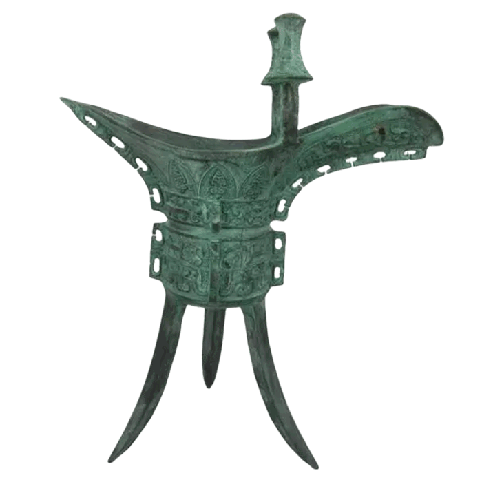
Designers can gain inspiration from the forms and functions of historical objects without filling the office with replicas. A review of several bronze wares can help project teams understand the visual differences between traditional vessel categories. That knowledge supports more informed selections and reduces the risk of combining unrelated forms simply because they share a bronze finish.
3. Keep the background calm
Background surfaces should make the office functional and visually breathable. Neutral walls, acoustic panels, clear glazing, simple flooring, and well-organized storage can provide the restraint needed for expressive art pieces. A calm setting does not mean a sterile setting. Texture can come from natural materials, understated textiles, or subtle changes in lighting temperature instead of additional ornament.
When a room already includes an ornate bronze object, avoid repeating highly decorative motifs in carpets, wallpaper, chair upholstery, and partitions. Select one or two of those layers for visual texture, not all of them.
Use Bronze Art as a Material Accent, Not a Repeated Theme
Bronze has an inherent presence that makes it suitable for professional interiors. Its weight, patina, and hand-finished character can create contrast against glass, stone, timber, or contemporary architectural metalwork. Yet its strength is also why designers should limit repetition. Several bronze objects grouped tightly together can make an office appear heavy, dark, or overly ceremonial.
A better strategy is to decide where bronze has the greatest value. Possible placements include:
- A reception focal point that establishes a memorable first impression.
- A boardroom display where an artwork communicates stability and long-term vision.
- An executive suite where a vessel, mirror, or animal sculpture adds personal character.
- A hospitality lounge where a low-profile bronze object complements seating and planting.
- A sheltered outdoor arrival zone where an appropriately scaled sculpture can be viewed from a distance.
For projects using antique-inspired surfaces, patina selection is essential. Dark brown, green, blackened, and warm antique finishes each interact differently with office lighting and surrounding materials. A deep patina can look refined against pale stone but may disappear against dark timber. Conversely, a brighter polished surface can become distracting under direct spotlights or near reflective glazing.
Before confirming an order, specify the desired appearance with physical references whenever possible. Discuss the intended installation area, wall colors, natural daylight, artificial lighting, and viewing distance. Consistent patina color matching is especially relevant when a project requires more than one bronze artwork within the same workplace.
Luoyang Yichuan Bronze Craft Co., Ltd. produces bronze artworks using premium Cu-Sn bronze alloy and the traditional lost-wax casting method. Hand chasing, polishing, and patina finishing can be considered when a project needs an antique or modern appearance. The company supports custom work from a single prototype onward, which can be useful when designers need one distinctive focal point rather than a large number of standard decorative items.
Match Object Scale to Office Function and Viewing Distance
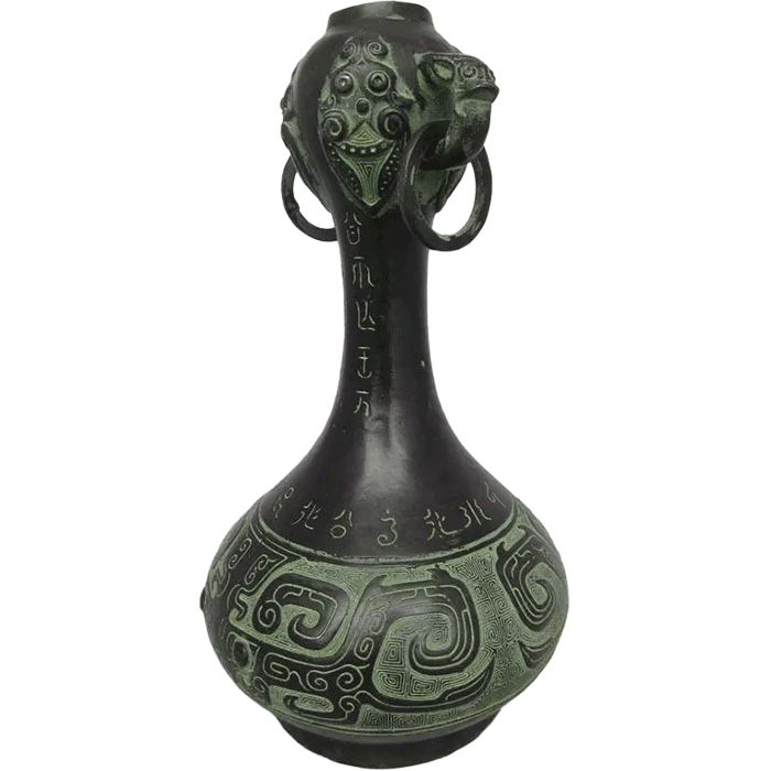
Scale is one of the clearest differences between a curated workplace and an overdone one. A small object can be lost in a large lobby, while an oversized sculpture can make a compact reception desk feel crowded. The right dimensions depend on the available floor area, ceiling height, viewing angles, circulation requirements, and the amount of surrounding visual activity.
Before selecting an artwork, map the visitor journey. Consider what the guest sees from the entry door, elevator lobby, waiting seats, meeting room threshold, and main circulation corridor. An object that looks proportionate in a showroom photograph may feel too small or too imposing in the actual office.
Questions to ask during the planning stage
- What is the artwork meant to communicate: welcome, heritage, leadership, innovation, calm, or prestige?
- Will visitors view it from close range, across a room, or while walking past?
- Does the selected object require a plinth, wall reinforcement, display case, or dedicated lighting?
- Will the installation affect cleaning access, emergency egress, seating clearances, or accessibility?
- Is the object intended to be the room’s main feature, or is it only a supporting detail?
- Will the finish remain visible under the planned lighting conditions?
| Office Area | Recommended Decorative Approach | Overdone Approach to Avoid |
|---|---|---|
| Reception | One substantial artwork with open viewing space | Multiple sculptures, vessels, screens, and ornamental counters competing together |
| Boardroom | One wall feature or one carefully placed object | Decorative objects on every cabinet, table, and wall |
| Executive Office | A personal but limited collection of one to three pieces | A dense display that reduces work surfaces and appears residential |
| Open Workspace | Subtle material references in shared areas | Frequent ornaments that distract from concentration and circulation |
| Corridor | Occasional wall-mounted or recessed displays | Floor objects that narrow the passage or create visual clutter |
For animal forms, the pose matters as much as the size. A dynamic galloping horse may suggest movement and energy, while a calmer seated or standing animal can be more suitable for focused, formal environments. Teams exploring this type of reference can review the cultural context of the bronze galloping horse before deciding whether an energetic form fits their workplace message.
Balance Cultural Reference With Brand Identity
The most successful interiors do not use cultural elements as generic decoration. Instead, they connect art choices to the organization’s story, values, location, customer profile, or leadership vision. A financial institution may choose a dignified vessel form that suggests continuity and stability. A technology company may prefer a contemporary bronze abstraction with a refined patina. A hospitality business may use an animal sculpture to establish warmth and recognition near the entrance.
Designers should avoid assuming that a culturally inspired office must rely on a narrow set of colors or symbols. Red, black, gold, carved timber, pagoda-like forms, and repeated calligraphy may create a recognizable visual shorthand, but using all of them can quickly make the space feel staged. A single historically informed bronze object can often convey more depth than several obvious thematic accessories.
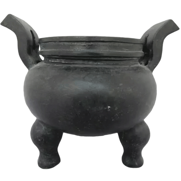
Research improves both design quality and cultural respect. For projects drawing from ancient Chinese vessel traditions, the Houmuwu square cauldron provides useful context on the visual authority of the ding form. Such references should inform proportion, symbolism, and display choices rather than be copied indiscriminately.
It is also important to distinguish between decorative suitability and religious significance. Bronze Buddhist statues may be appropriate for specific hospitality, cultural, wellness, or private spaces where the concept and client context support their use. In a general corporate office, they should be selected thoughtfully and positioned with respect. They should not be treated as interchangeable ornaments or used merely to fill an empty shelf.
Create a Practical Specification and Procurement Plan
A disciplined procurement process prevents late-stage additions from undermining the original design concept. Rather than purchasing many small objects once construction is nearly complete, prepare an art schedule alongside the furniture and finish schedules. This document can identify the location, purpose, dimensions, material, finish, mounting method, lighting needs, and approval responsibility for every selected artwork.
For custom bronze art, provide clear documentation early. This may include concept sketches, CAD dimensions, reference photos, preferred patina samples, installation drawings, and packaging requirements. A custom supplier can then review whether the intended form is suitable for lost-wax casting and finishing.
Luoyang Yichuan Bronze Craft Co., Ltd. is located in Yichuan County, Luoyang, Henan Province, and operates a 3,000-square-meter production area with more than 30 skilled craftsmen, including bronze-casting masters and finishing artisans. Its annual output exceeds 50,000 bronze art pieces, while custom sculpture orders can begin from one piece. Bulk-order arrangements can be discussed according to size and design complexity.
For fit-out buyers, quality control and logistics should be part of the specification, not an afterthought. Bronze sculptures and fragile decorative forms need protective export-compliant packaging suited to their shape and finish. Quality inspection before shipment, clear installation planning, and defined after-sales communication are especially important for projects with tight handover schedules. The company provides inspection before shipment, replacement for casting defects, and support for patina touch-ups and restoration guidance.
When reviewing possible suppliers, project teams may also consult the company’s about scultmart page and explore options for custom bronze sculpture development. The goal is not to fill a decorative checklist, but to obtain artwork that suits the project’s scale, function, and visual priorities.
Use Restraint as the Final Design Decision
The final stage of office styling should involve editing. Remove objects that repeat the same message, obscure the architecture, crowd useful surfaces, or lack a direct connection to the design story. A restrained interior is not empty; it is selective. It gives important pieces enough space to be noticed and allows people to work, meet, and move through the office comfortably.
Asian Style Office Decor becomes overdone when it relies on quantity, stereotypes, or repeated visual signals. It feels refined when a few well-scaled, culturally informed, and professionally made objects are integrated into a functional workplace. One bronze vessel in the right reception setting, one animal sculpture at an arrival point, or one custom artwork in a boardroom can have greater impact than a crowded collection of decorative accessories.
For early-stage workplace planning, begin with the business identity, spatial function, material palette, and visitor journey. Then select art that supports those decisions. This process creates an office that feels composed, distinctive, and enduring rather than themed.